Thursday, 9 May 2013

Perspective refresher (Tank)

Thumbnail for the design and angle I was looking for, working out how far away the vanishing points need to be and where the horizon line is.

My finished perspective drawing of the Abraham's Tank, using the thumbnail to work out where my points and horizon would've been. Quickly sketching in lightly rough shapes helped a lot in working out where certain parts went on the page. 

Tuesday, 7 May 2013

Nightcrawler


Here's a quick-ish 3D model of Nightcrawler following the steps I learnt from the Minotaur tutorials. I'm happy with the outcome as it didn't take very long to reach this stage of the model. The Minotaur tutorials really helped me with symmetry modelling and quick box modelling as well as good topology. 

Saturday, 4 May 2013

Underwater Creature Research


I've decided to go down the track of making a scary, mean looking fish inspired by features of the Goliath Tiger Fish. 

Wednesday, 1 May 2013

Fish designs


Some design sketches I did planning on what I wanted my Monster fish to look like. Inspirations from Catfish and Tiger Fish. 

River Monster


Here's my 3D model for the fish monster assignment. I used features from different fish that I know of and which I looked at. The main inspirations came from the Tiger Fish while watching River Monsters. I'm rather happy with the end result however I struggled texturing the fins as I had to take an existing fin texture and warp it in different shapes to fit the different fins. The eye was also difficult as it doesn't blend in with the head of the fish very well. 

Thursday, 25 April 2013

Minotaur Topology

Part 1


Part 2


Part 3


Part 4


Part 5


I'm very happy with the outcome of the Minotaur after the first 5 steps of the video tutorials. They've taught me well on turning simply topology into more advanced shapes by adding in edges at the right places at the right times. Instead of doing one area highly detailed, do it all very simply first as it's easier to manipulate on the fly as and when you need to.

Thursday, 14 February 2013

Quick Box Modelling


a quick exercise to understand how simple topology is key to creating a better model through box modelling. I believe I understand the concept quite well and will practise with other models. 

Thursday, 7 February 2013

3D Avatar


Before smoothing

After smoothing

I've enjoyed working on this as this is where I first started using symmetry modifiers properly with my modelling and they sure save a lot of time. I feel as if the head is too big on the model though which slightly messes with the proportions. I found altering the verts on the face to put them in the right place quite tedious and difficult.

I started adding textures to the model


Wednesday, 30 January 2013

Cannon Paintover - XM-Plazma 3000


Here's the finished paintover of the 3D cannon. I'm happy with the outcome as the textures and painting I applied on top of the 3D model has kept it's lighting that I set up in Max due to the layer options in Photoshop. However, I do feel as if the lighting could have been done better to give the image a more cinematic appeal. 

WIPs of Cannon Paintover


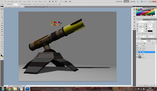
Here you can see I have started to paint a solid colour over each section of the cannon.


After painting the solid colours.


Applying texture, skewing so it goes with the perspective of the model.


Using the warp tool to bend the texture around corners.


Warping a texture into the correct shape, maintaining perspective.


Adding text and skewing it into perspective.


Skewing textures into perspective.


Finished paintover after altering the contrast a little bit.


Cannon Render


Lighting Setup


I used 2 omni lights to light my cannon for the render. I had the main omni light above the cannon with a density of 1 and another omni light near the ground, between the camera and the cannon with a density of just 0.15 to create reflected light as some areas were too dark. 

3D Model WIPs


Leg


Leg and base


Legs, base and swivel


Cannon


Finished cannon (before putting it on the swivel)

Cannon Design Sketches


I originally wanted to go along the lines of the top left image, but in my head it was too small. I wanted to go go with a design that had a larger scale. I liked the base of the 2nd design and the cannon of the 4th design, so I combined the 2:


This gave me the large scale weapon I was looking for.

Cannon Moodboard


Video Notes

1:49 opens in photoshop
1:49 uses polygonal lasso tool to select an area
1:50 spot healing tool
1:50 paints minor detail
1:53 applies logo
1:54 uses skew tool on logo
1:57 uses text
2:07 applies a texture, uses screen mode
2:08 skews texture
2:26 applies brushed metal texture
2:27 deleted unwanted areas
2:28 uses warp tool
2:31 uses paste into
2:41 hue & saturation
3:00 brightness & contrast
3:20 dodge tool
3:36 paints highlights

Thursday, 24 January 2013

Alien Plant Painting


I decided to lean away from the design I went with into Mudbox and went with one of the other designs instead, as the one I was using wasn't very alien. I did a Photoshop painting using the line work of the sketch. I'm much happier with this outcome than the Mudbox piece. I'll have to practice with Mudbox to gain some skills with the programme so that I am able to create these designs.